Pintarnya

Background
Pintarnya is a platform that connects blue-collar workers in Indonesia with employment and financial opportunities. They were focused on ensuring job seekers had a positive experience, so they prioritized initiatives that would keep them engaged and encourage them to apply for jobs.

Project Outcome
This is what we got after the feature was released:

This shows that the feature is incredibly helpful in boosting users' confidence to apply for more jobs. The following is the process I followed to achieve this ✨
Design Process
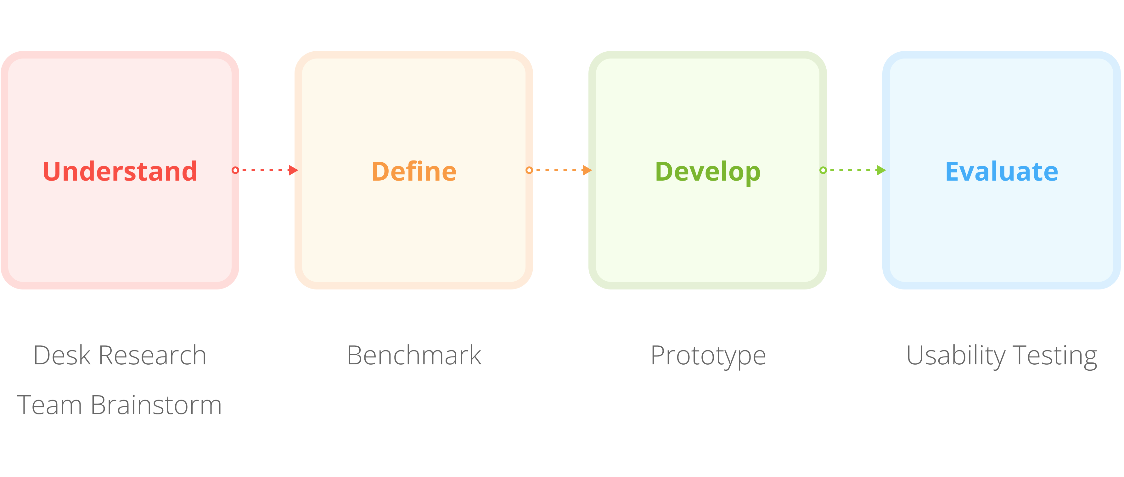
Brainstorming Ideas
In the long run, the goal is to make it easier for employers to find valid, legit, and skilled job seekers. This will help more job seekers get invited to interviews and solve The Problem. To support this, we brainstormed a couple of ideas that could be initiated from the job seeker platform’s side:

Overall, the skill quizzes is the best option. Moreover, similar to the milestone badges concept, we could use the sense of accomplishment after doing a quiz to drive confidence and encourage users to be more active on the platform.
Benchmarking
I benchmarked other platforms implementing something similar to skill quizzes to discover UI/UX possibilities and current industry standards.
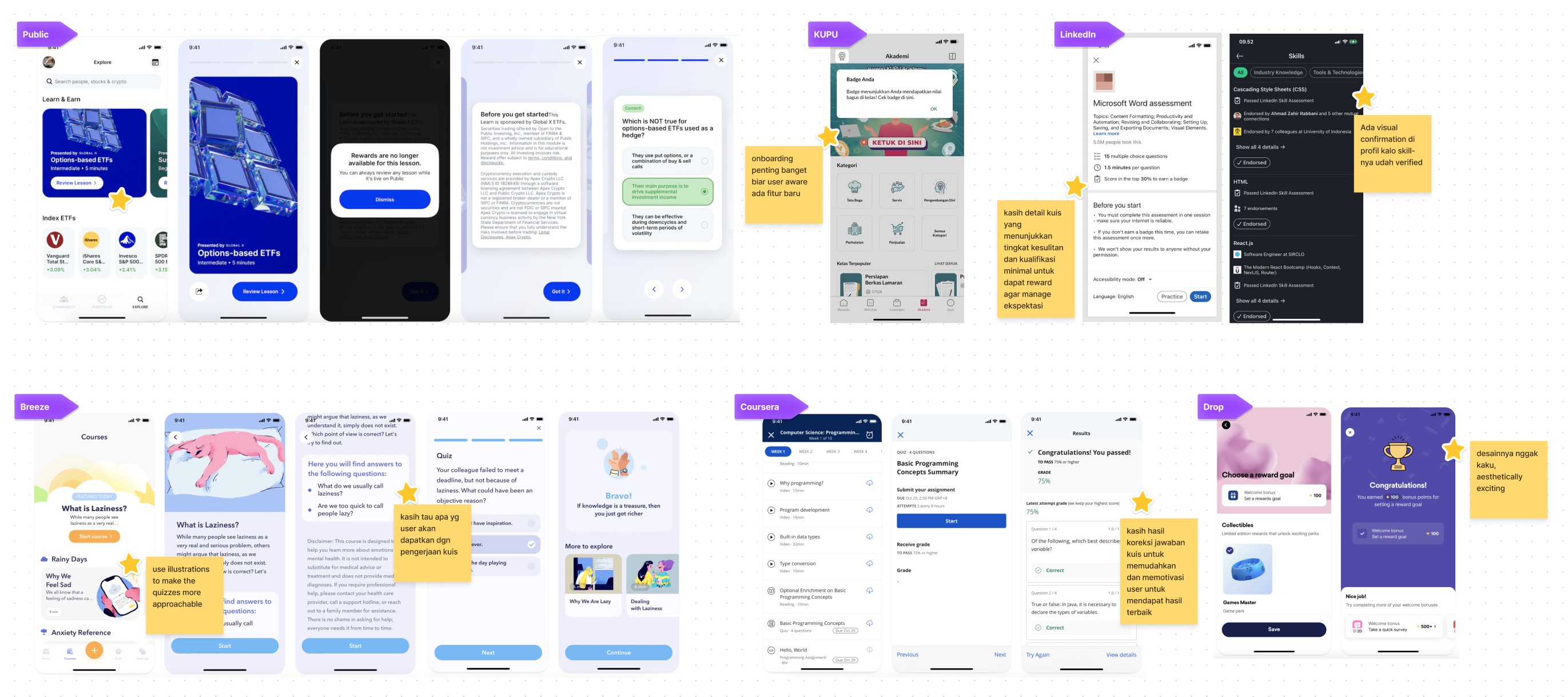
I was excited to see how other companies were approaching skill quizzes. I learned a lot about different ways to present questions, provide feedback, and track progress. I also saw some common mistakes that I wanted to avoid.
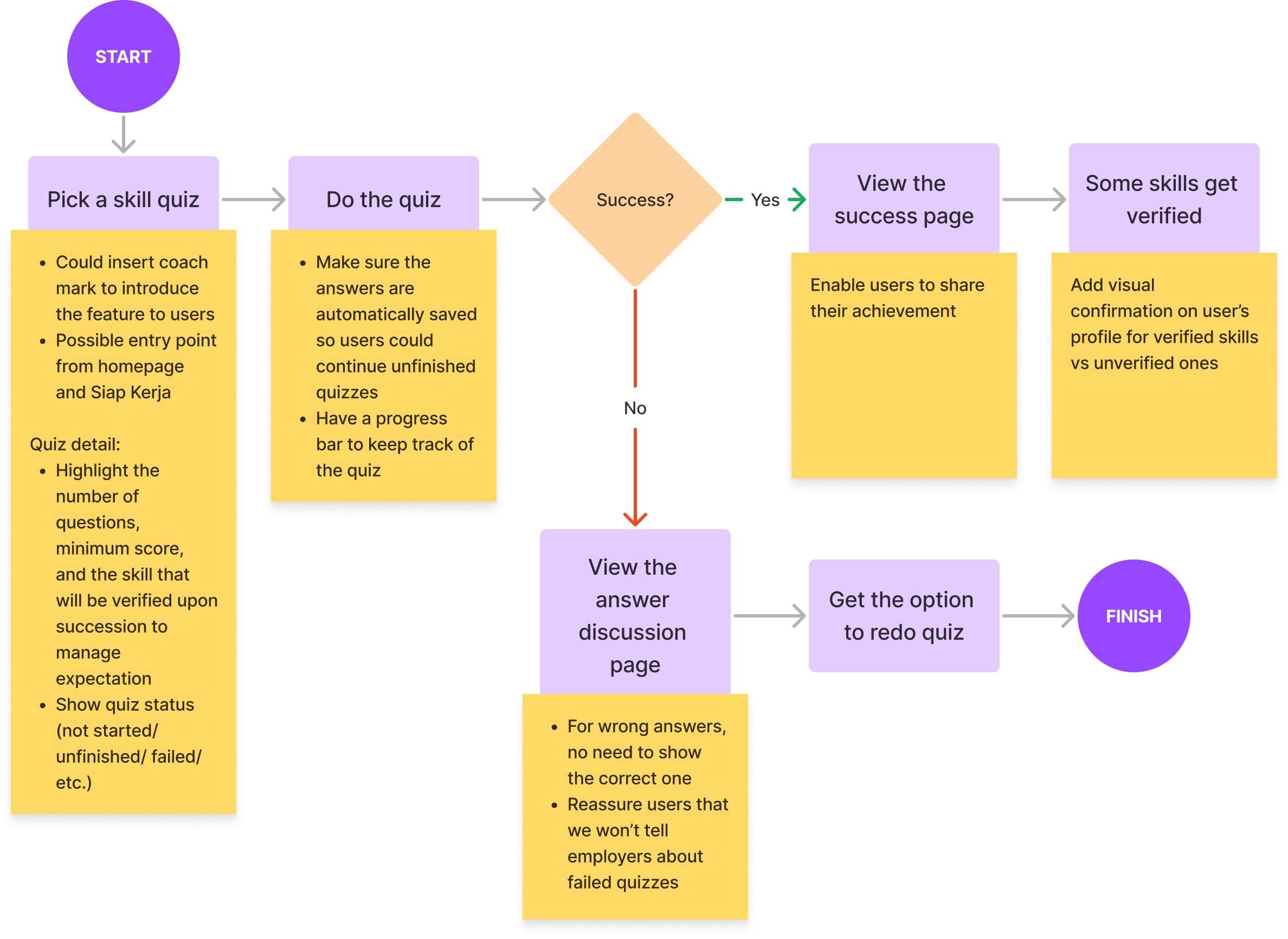
With this information in mind, I was able to create a user flow that is both user-friendly and effective. I also identified some opportunities to add features that would make the quiz even more engaging and helpful.
Prototyping
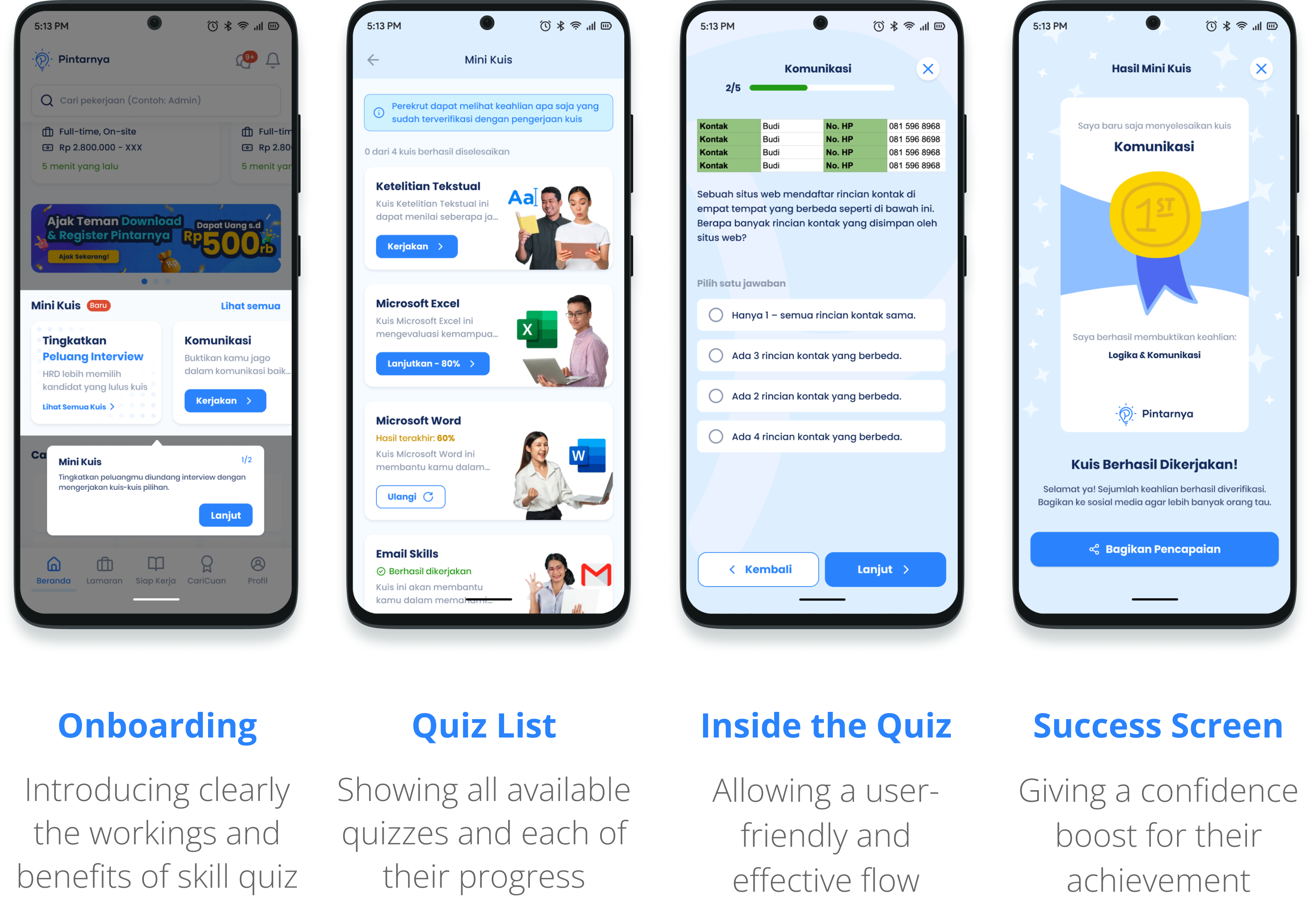
I decided to skip wireframing and go straight to designing the high-fidelity prototype. This allowed me to get a more accurate representation of the final product and save time in the long run. Check out some of the screens below!
Usability Testing
I Google Meet with four Pintarnya users to get their feedback on the product. We also asked them about their understanding of the value of doing skill quizzes for skill verification, and their motivation towards raising their profile's value in the eye of employers. Here's what we learned:
On skill importance
Users understand that it is important to highlight their skills to employers, but this is not always at the forefront of their minds.
On motivation for improvement
Users are motivated to improve their profiles, but they are not sure how to do this other than by improving the design of their CVs.
On sense of accomplishment
Users feel a sense of accomplishment after completing a quiz and would want to try as many as they can back to back.
Overall, we found that users were positive about the product and its potential to help them improve their skills and find better jobs. However, a few potential improvements were identified in the copywriting and UI.
Final Product
Here it is! Check out the final product, which has been adopted by an average of 20% of daily job seekers in just one month, thanks to the feedback of our users.

Onboarding: The product title and key message were changed to avoid users misunderstanding the product as an interview prep tool
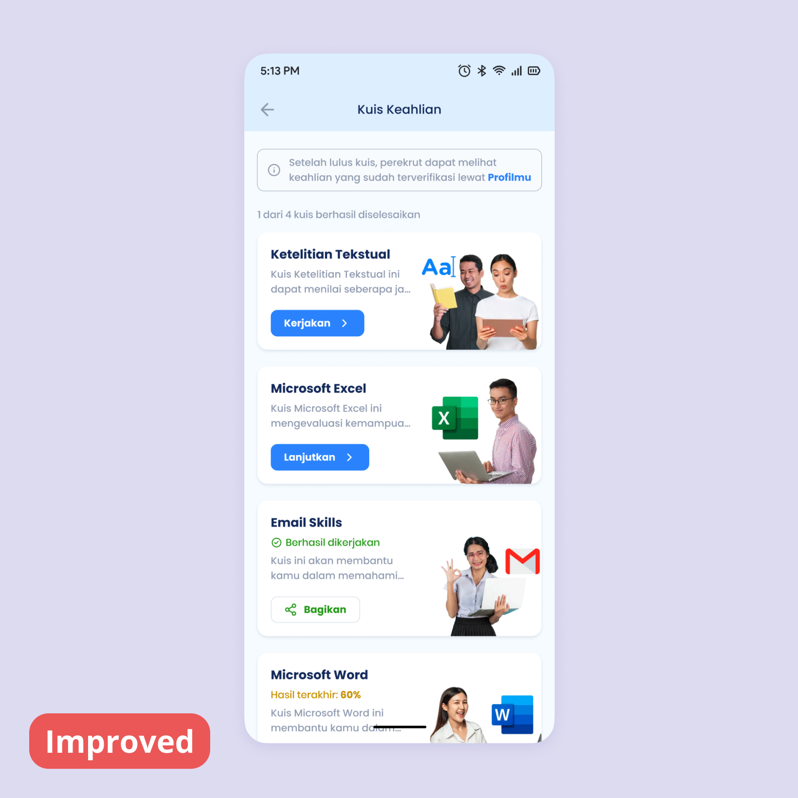
Quiz List: The disclaimer on the info banner was clarified to help users better understand the function of the skill quizzes

Inside the Quiz: The quiz itself remains the same, and users have no concerns about its UX

Success Screen: The user's name is added to the shareable image to add a personal touch and boost their sense of accomplishment
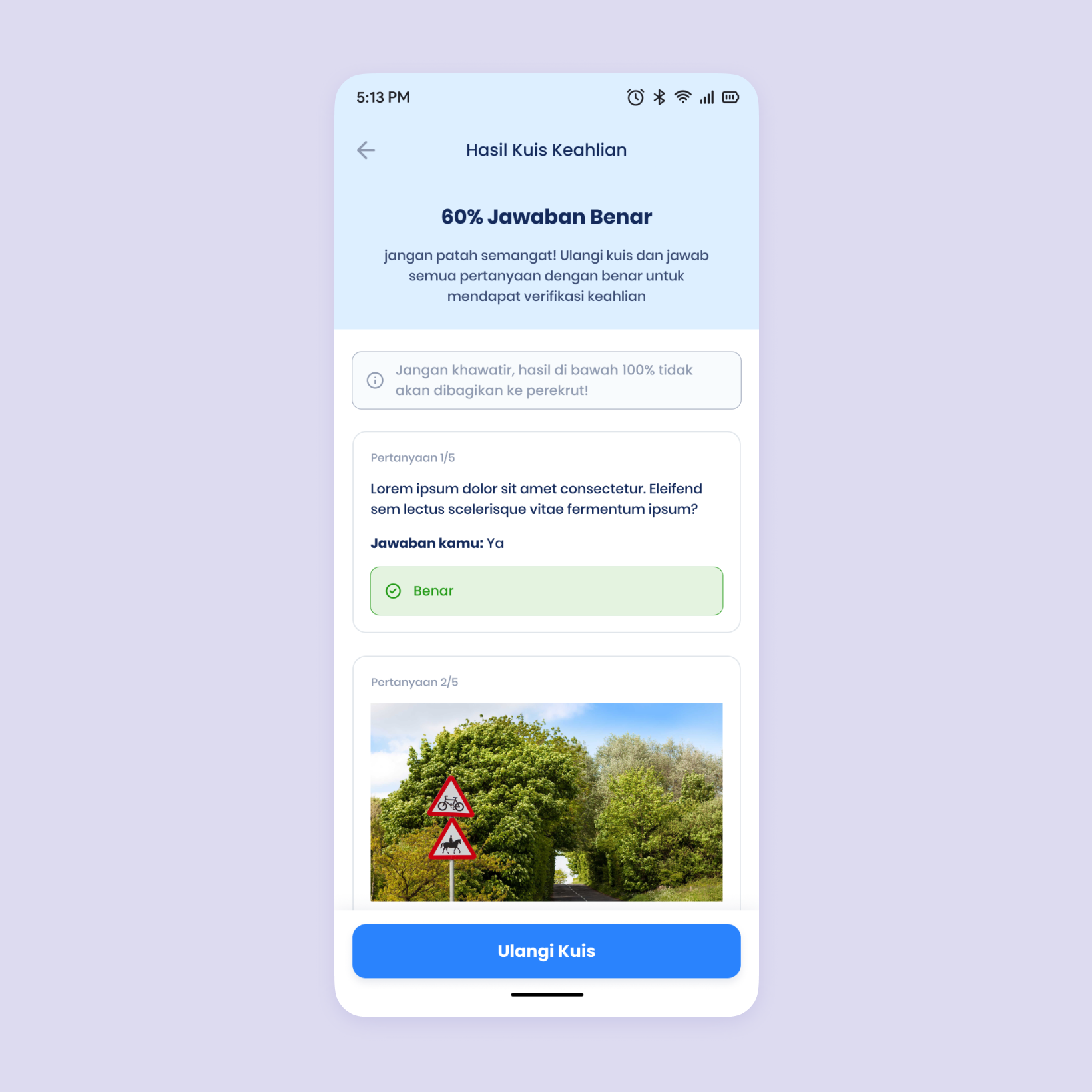
Quiz Result Discussion: Clear and concise, with no major usability issues

Profile Page: Verified skills are marked, and an entry point to skill quizzes is added to raise awareness of the feature