Justika
Background
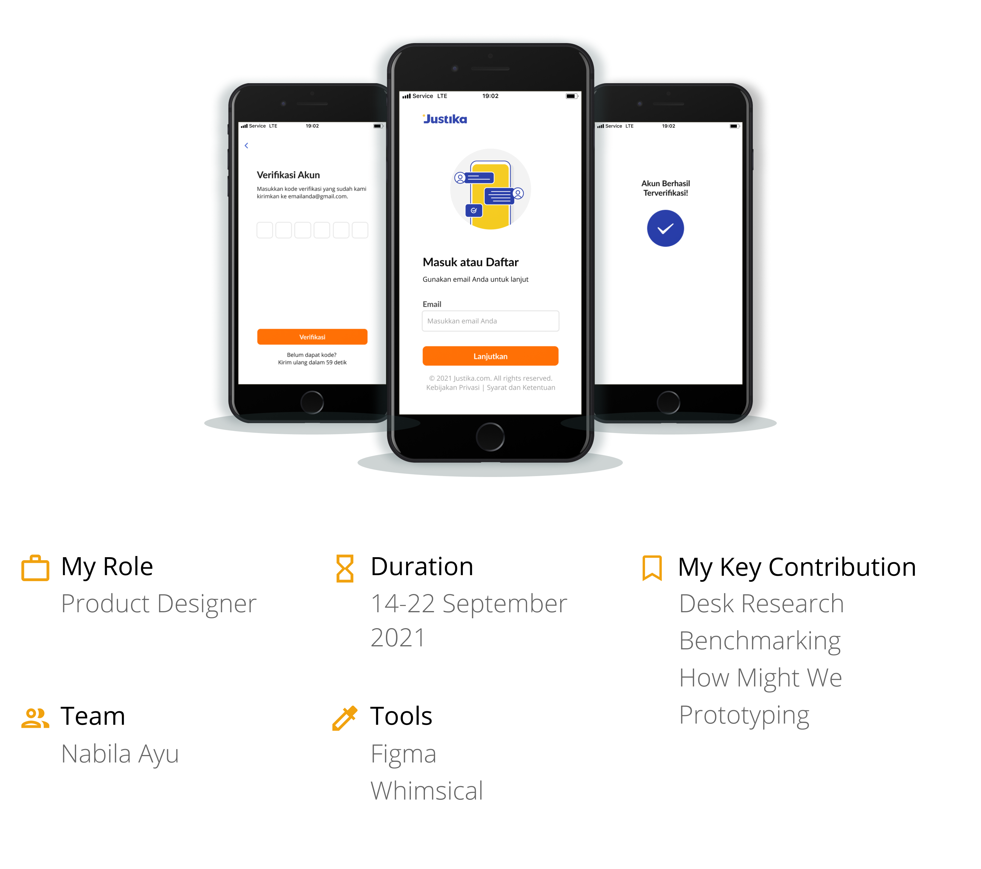
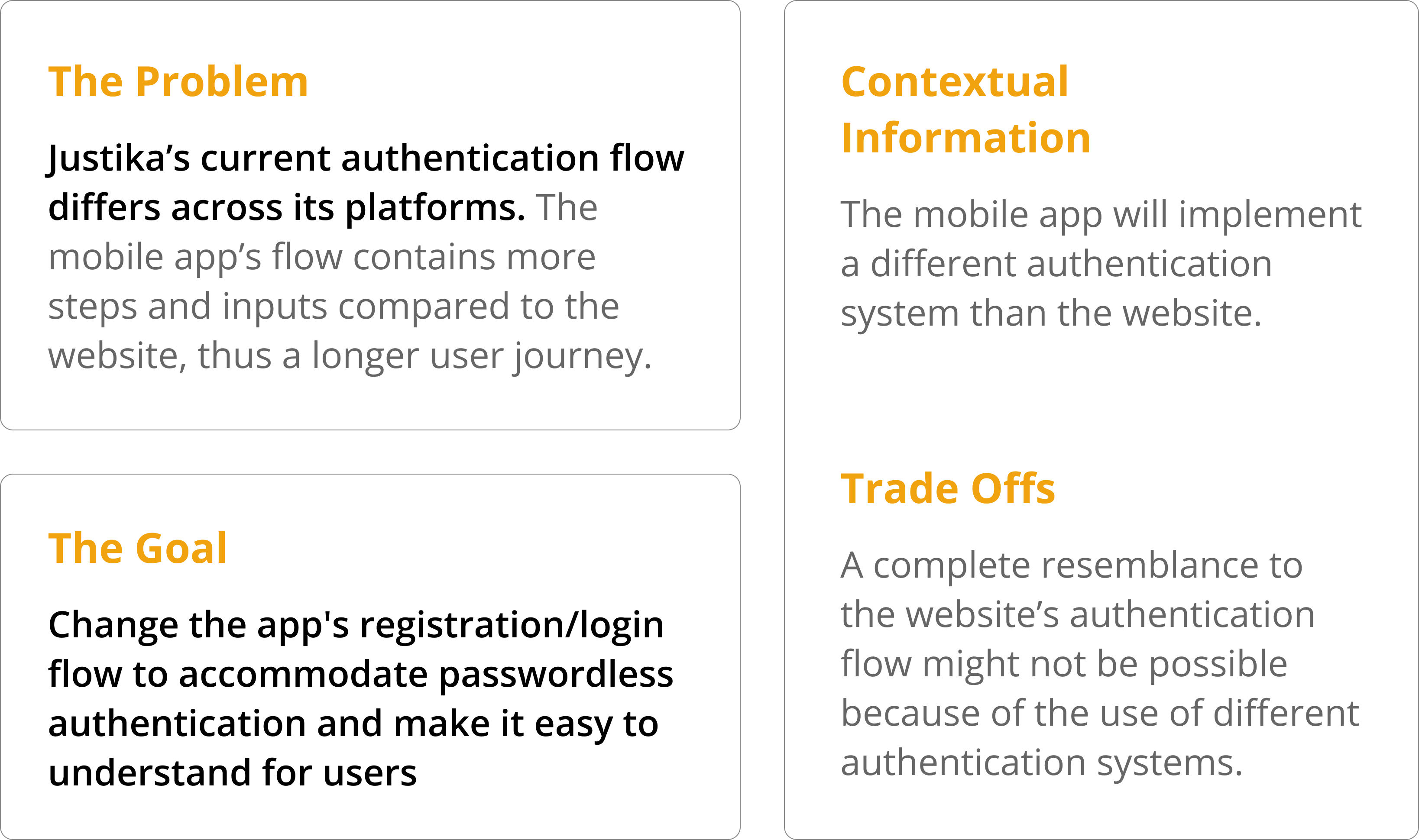
Justika is an online legal consultation platform that's available on a website and mobile app. The Justika mobile app was still implementing a traditional flow of account registration/login, as opposed to their website which has already used passwordless authentication. Therefore, it is necessary to change the registration/login user flow on the app to passwordless so that it shortens the steps that the user needs to go through when using the app for the first time. Justika's mobile app login improvement was one of the projects I handled during my internship there.
Project Outcome
This is what we got after implementing the solution I proposed for the app:
📈 42.6%
increase in login success rate shown a week after this improvement was released in production. The following process is how I achieved it ✨
Design Process
Preceded with a project brief and followed by design review, then putting it to app development.
Current User Journey
To give more context, here is the current registration/login user journey on the app.

Current Screens
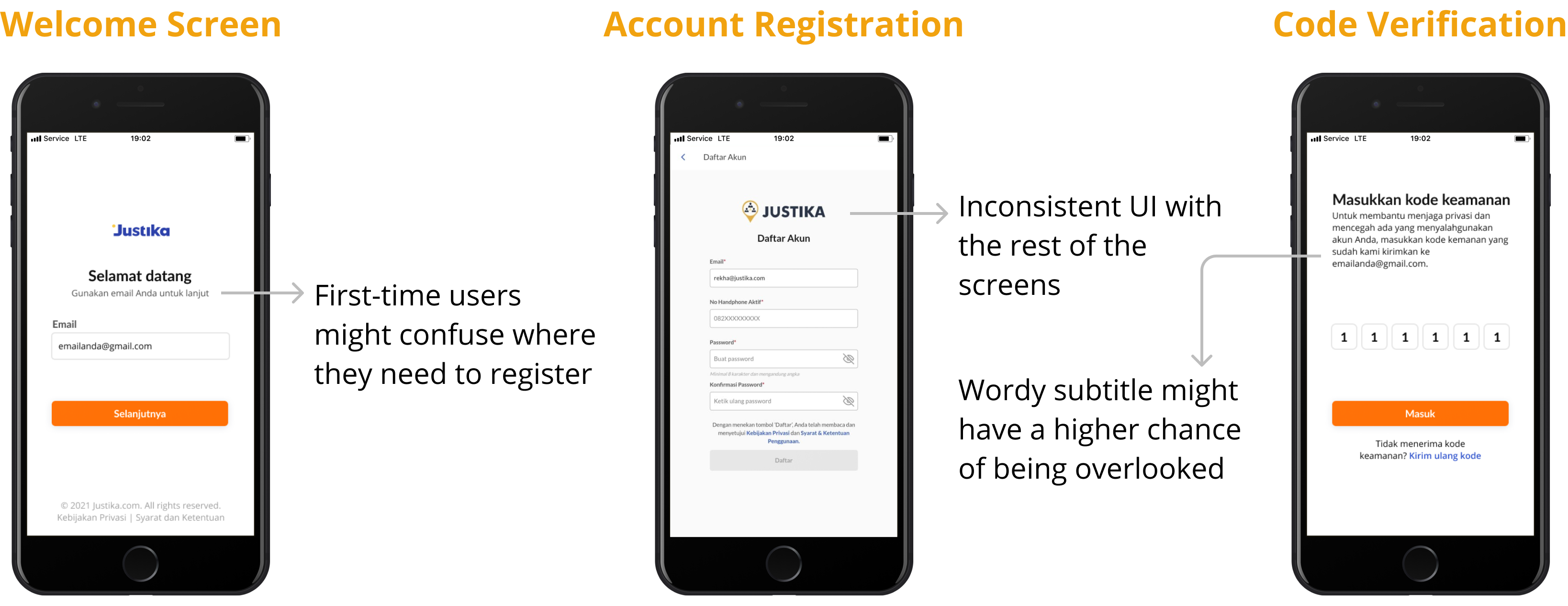
Before moving on, I did a little analysis of the current screens to pinpoint where else I could improve from the UI.
😱 Engineering Limitation
The possible trade-off I mentioned earlier turned out to be true. The OTP code that will be used in the app login will expire after only 3 minutes, in contrast to the 30 minutes expiration time of the web OTP code. I need to know how this shortened expiration time will affect the app's usability, thus leading me to my current hypothesis:
Hypothesis #1Clients need OTP expiration time more than 3 minutes to be able to register/login seamlessly and unhurriedly.
Benchmarking
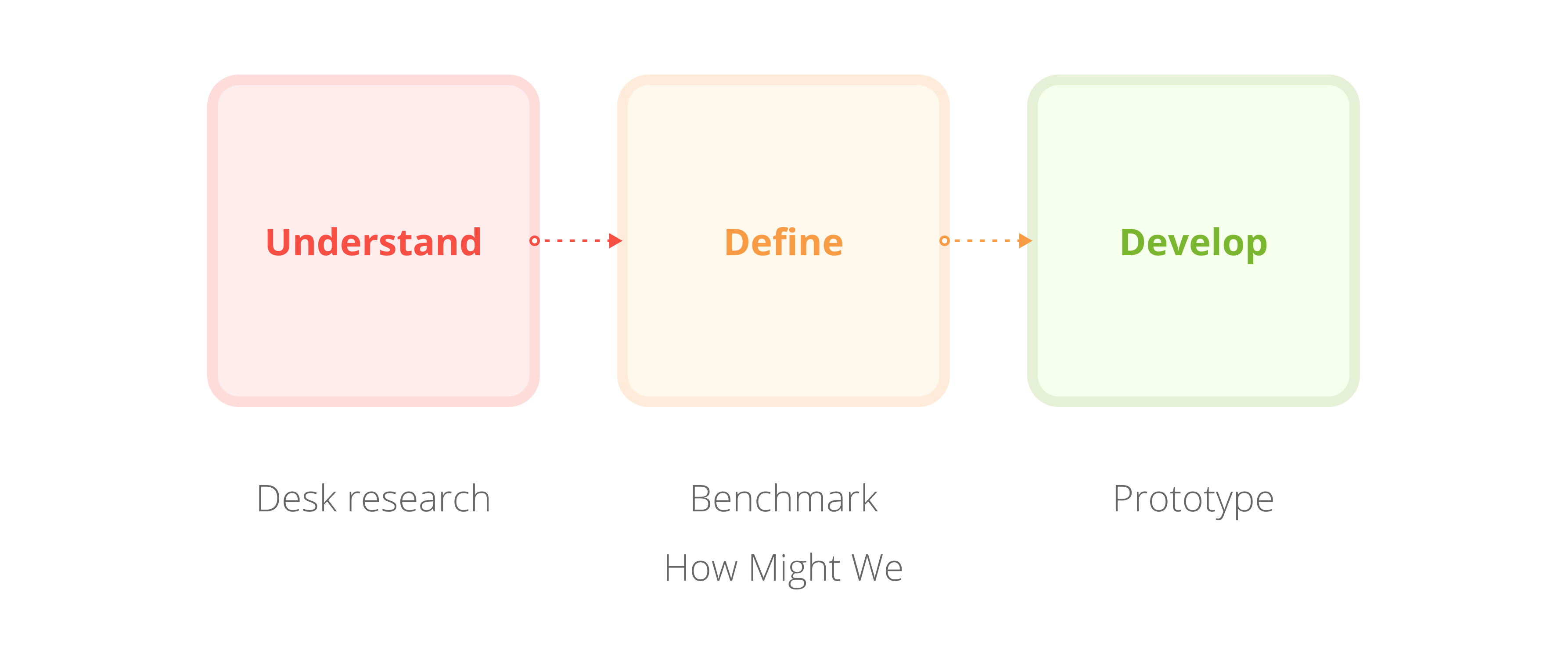
To validate the hypothesis above and to discover current industry standards for passwordless authentication, I then did a benchmark with other apps that are implementing the same authentication flow.
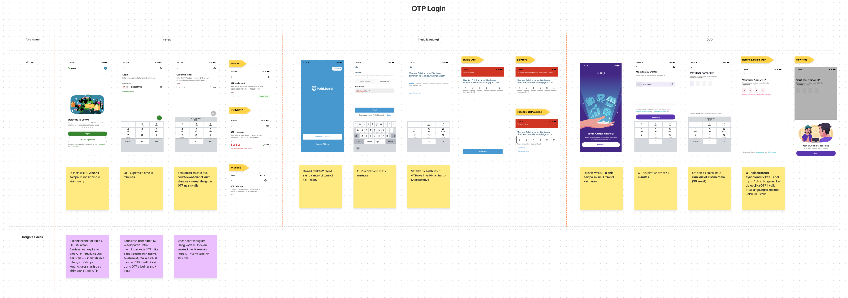
3 minutes OTP expiration time is okay
Applications, on average, have an OTP expiration time from 2 up to 5 minutes. So, we can conclude that 3 minutes is not too short an expiration time, as long as the user has the option to resend the OTP code.
HMW inform users about the OTP expiration time?
Have a max limit of incorrect OTP input
If the max limit is not applied, people with malicious intent can brute force until they find the correct code. Most apps give 5 opportunities to input the OTP code.
HMW handle users who have maxed out on incorrect OTP inputs?
Create a more user friendly welcome screen
Most of the apps I benchmarked shows a welcoming illustration upon opening the app for the first time and also provided a clear instruction copy on what to do.
HMW make the welcome screen more user friendly?
How Might We
Here, I tried to capture the opportunities presented from the recommendations I derived in the benchmarking step.
#1 HMW inform users about the OTP expiration time?
- Put helper text on code verification page
- Add expiration time information on the OTP email ✅
#2 HMW handle users who have maxed out on incorrect OTP inputs?
- Show an inline error message ✅
- Disable verification button, so users won't have other options but to resend the code in order to try again ✅
#3 HMW make the welcome screen more user friendly?
- Add an illustration to freshen up the welcome screen ✅
- Show a title that reflects clearly on what the email input is for ✅
Wireframing & Prototyping
After analyzing the opportunities while considering which would take the least effort, I then continued wireframing my ideas.
Note: I'm only showing the positive flow to make it concise, but in reality, there were numerous negative flows defined in the making of the prototype.

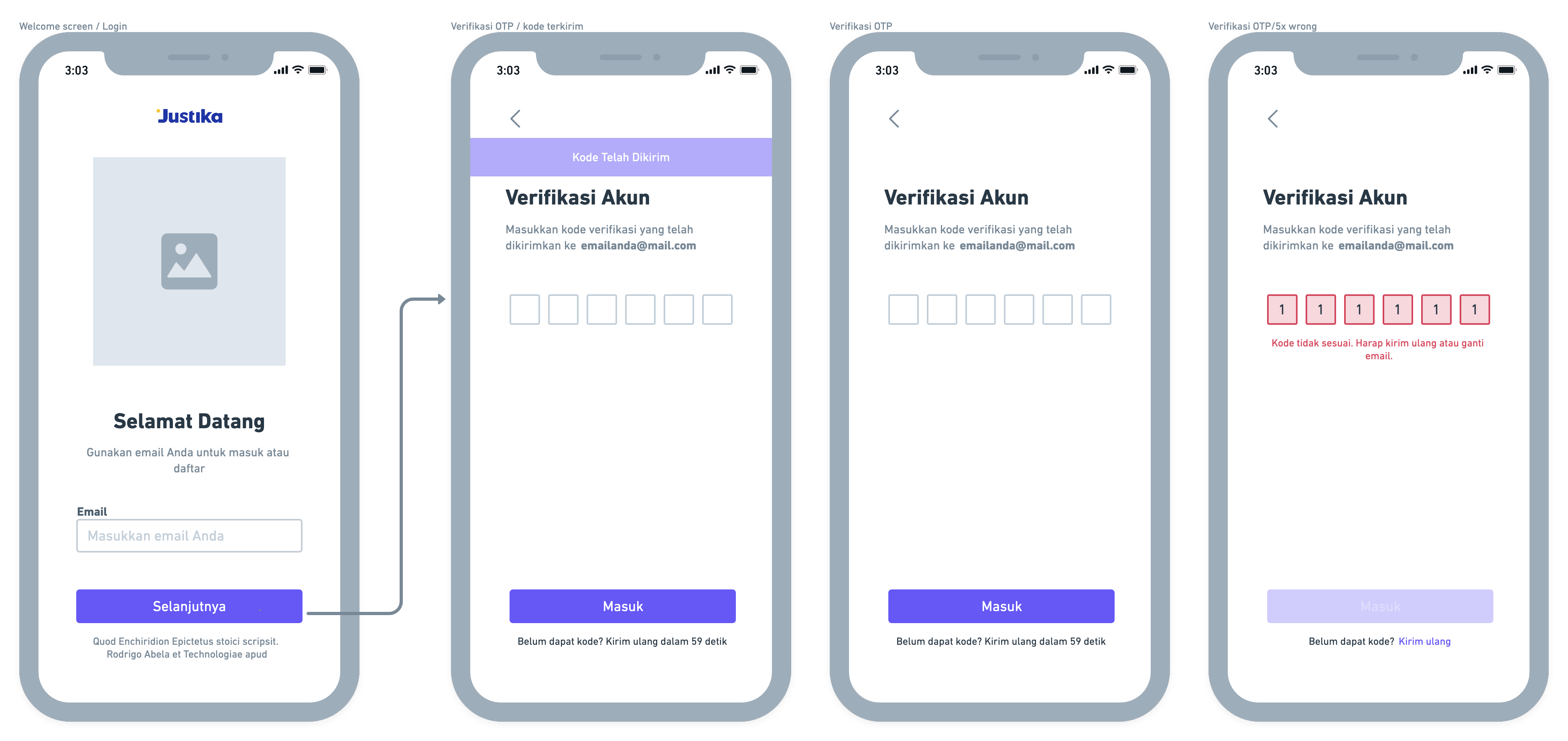
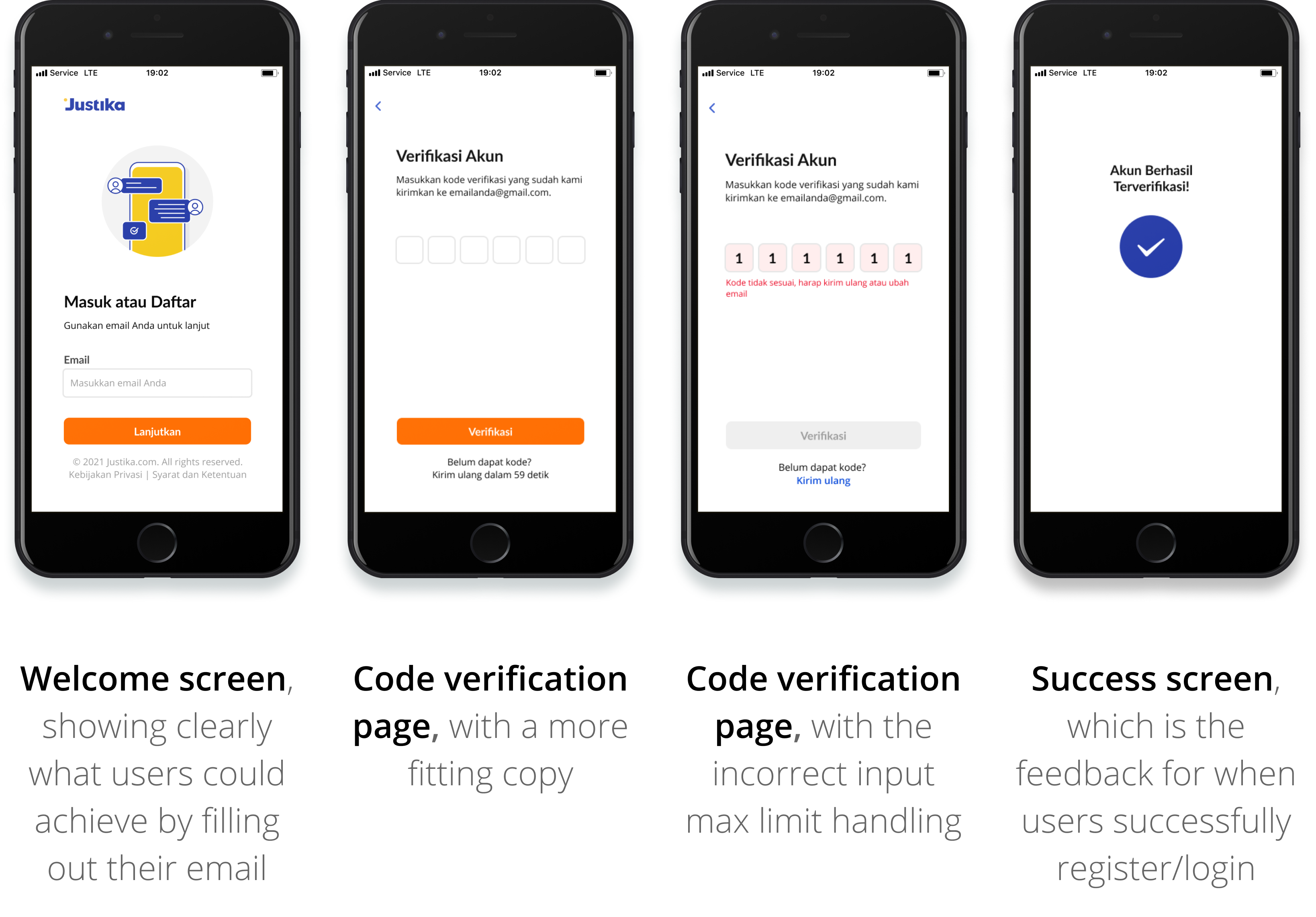
There were a few changes and additions, but here is the final prototype:
Learnings
What I learned most during the running of this project is definitely how to communicate with engineers. Because the project handles the app's authentication process, its solutions rely heavily on technical feasibility. Each condition I defined requires a back-and-forth to make sure the system will be able to catch it. I found that the more I communicate with engineers during the design process, the smoother it is when it's time to review and hand over the project.